
UI/UX CASE STUDY
Couture Candy: A CRO-Led UX Redesign That Lifted Conversions by Over 53%
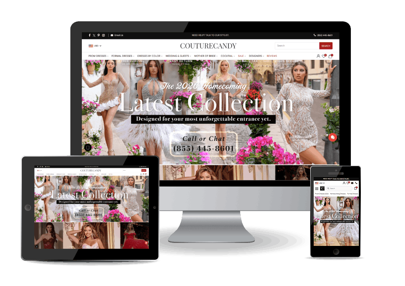
Working from heatmap and Google Search Console data, we reworked the six areas where shoppers were dropping off: navigation, product pages, checkout, mobile, colour selection, and filtering.
+53%
Conversion Rate
Overall Uplift
6 Areas
Reworked
Navigation · Product Pages · Checkout · Mobile · Colour · Filters
Heatmap + GSC
Data-Led CRO
Dead-clicks and traffic mapped before any redesign
Mobile-First
Navigation Reworked
Higher visibility for top categories
Project Context
Client
Couture Candy
Niche
UI/UX · CRO · Fashion E-Commerce
The Tech Stack
- Heatmap Analysis
- Google Search Console (GSC)
- CRO Audit
- Navigation / IA Redesign
- BNPL Integration
- Faceted Filtering
- Visual Merchandising
- Mobile UX
"We wanted our store to be easier to shop, and to turn more of the traffic we already had into buyers."
Their traffic and catalogue were already strong, so the answer was never a cosmetic redesign. The losses sat in specific usability gaps, and fixing those causes is where we focused.

Couture Candy Team
Women’s Occasion Wear · 15+ Years
THE OPTIMISATION
A Smoother Path From Browsing to Buying
For a shopper, the redesign shows up as a store that is quicker to search, easier to decide in, and simpler to pay from. Here is what that feels like from the other side of the screen:
For Couture Candy Shoppers
- Find a specific dress in a couple of clicks, not a long scroll
- See the details and value that answer your questions before you buy
- Check out in fewer steps, with clear reassurance before you pay
- Browse and search comfortably on your phone
- Pick a colour by sight, with swatches and a shop-by-colour palette
- Narrow a huge catalogue by size, colour, and style
HOW WE APPROACHED IT
A Data-Led CRO Process, Not a Cosmetic Refresh
We treated this as a CRO project, not a cosmetic refresh. Data located the problems, the audit prioritised them, and each change removed a specific reason shoppers were not converting.

Heatmap Analysis
Read heatmaps to find dead clicks, the areas shoppers actually used, and where
attention was being wasted.

Search Console Data
Used Google Search Console data to see which categories and queries drove traffic,
so navigation could match real demand.

CRO Audit
Audited the full journey, home to checkout, against conversion best practice
to list every point of friction.

Prioritisation
Ranked the fixes by likely impact on conversion, so the highest-friction areas were tackled first.

Navigation & IA
Restructured the menu and added style, colour, and designer submenus for popular categories.

Product & Checkout
Enriched product pages and shortened the checkout with clearer value and reassurance.

Mobile & Merchandising
Reworked mobile navigation and search, and made colour selection visual.

Measure
Tracked conversion rate against the changes to confirm the uplift held.
WHAT WE CHANGED
Six Changes, Each Aimed at a Specific Drop-Off
Each change targeted one drop-off point. Here is what shoppers see now, and why it moves them closer to purchase.
Navigation Optimisation
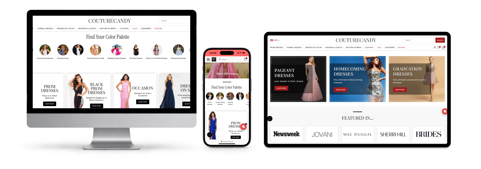
The old menu overwhelmed shoppers. Guided by heatmap and GSC data, we reorganised categories around real traffic and added submenus, by style, colour, and designer, for popular lines like prom dresses, so a specific dress is a couple of clicks away.

Product Page Enhancements
Thin descriptions left shoppers unsure at the point of decision. We added value-led descriptions that spell out key features and benefits, and resized and recoloured the icons and wishlist controls, so the page answers the buying question instead of raising it.

Checkout Optimisation
Too many steps cost sales at the last moment. We shortened the flow, surfaced Buy Now, Pay Later with instalment amounts on the cart, added product reviews at the cart, and badged free shipping, easy returns, and price match, so the final step reassures instead of stalling.

Mobile Navigation
Most shoppers arrive on mobile. We moved main categories into the mobile link bar, enlarged the search bar, and added a swipe through popular and seasonal categories, so top sections get the visibility and clicks they were missing.

Visual Colour Display
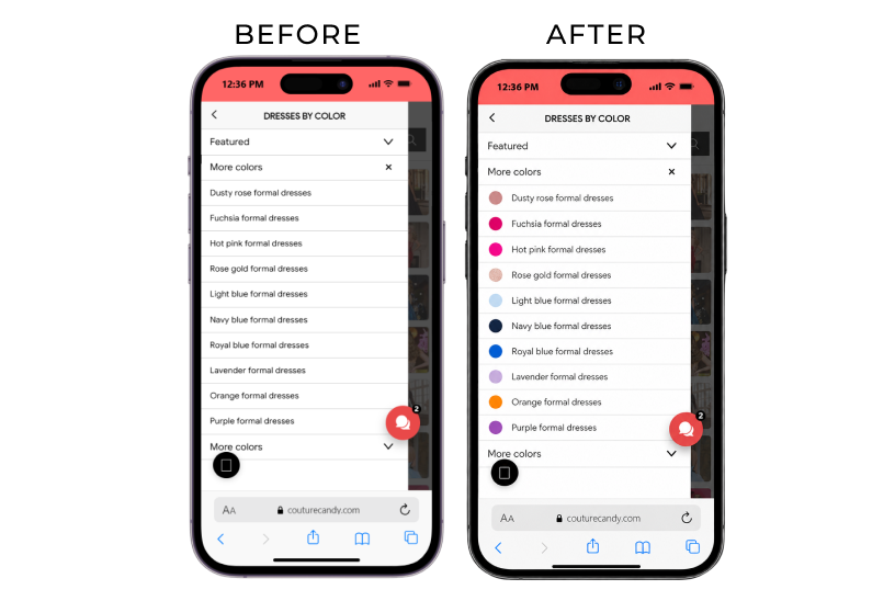
Colour was text-only, which slows a visual purchase. We replaced it with a colour swatch display and added a shop-by-colour palette on the homepage, so shoppers spot the shade they want at a glance.
Advanced Filtering
A deep catalogue only helps if it can be narrowed. We added filters for size, colour, style, and more to collection pages, cutting the effort to reach the right dress and the frustration that sends shoppers away.

THE PROBLEMS WE SOLVED
What the Data and Audit Found Before the Redesign
This section is about the diagnosis behind the redesign, not the feature list. Before any design work, the heatmap data and the CRO audit surfaced four problems holding conversions back:
An Overwhelming Menu
The navigation menu was dense and hard to scan, so shoppers struggled to find a specific dress. The challenge was reorganising it around what traffic data showed people actually wanted, not the internal category hierarchy.
Product Pages That Raised Doubt
Descriptions lacked detail, leaving shoppers hesitant right at the point of decision. The page had to answer the buying question up front rather than sending shoppers elsewhere to find the answer.
A Checkout That Lost Carts
Too many steps in the checkout created friction and drove cart abandonment. Shortening the flow was only half of it; the final step also had to reassure on payment, shipping, and returns.
A Layout That Fought Mobile
A confusing layout and weak mobile responsiveness made the store hard to use on the devices most shoppers were on, which put the largest share of traffic on the worst experience.
Colour Sold as Text
On occasion wear, shade is often the deciding factor, but colour was listed as text names only. Shoppers had to imagine the difference between one name and another, or open products one at a time to see it.
A Deep Catalogue With No Way In
Fixing the menu got shoppers to the right collection, but nothing narrowed it once they arrived. Without filters for size, colour, and style, a large catalogue became a long scroll at exactly the point interest was highest.
WHAT WAS DELIVERED
From "Convert More Traffic" to a Measured 53% Lift
This section maps the brief to the outcome: what Couture Candy asked for, and what it actually means now that the changes are live.
| VISION | DELIVERED | |
| Findability | “Help shoppers find a specific dress fast” | A reorganised menu based on real traffic, with style, colour, and designer submenus for popular categories. |
| Product Confidence | “Reduce hesitation on product pages” | Value-led descriptions, clearer rescaled icons, and improved wishlist controls give shoppers greater confidence when making purchase decisions. |
| Checkout Completion | “Cut cart abandonment and simplify checkout” | A shorter checkout with BNPL instalments, cart-level reviews, and trust badges reduces friction and builds purchase confidence. |
| Mobile Experience | “Make the store easy to use on mobile” | A mobile category bar, larger search field, and swipeable category browsing create a faster, more intuitive mobile shopping experience. |
| Conversion | “Turn more traffic into buyers” | The combined experience improvements delivered over a 53% improvement in the overall conversion rate. |
WHAT TO EXPECT FROM US
Transparent, Data-Led Delivery for CRO and UX Projects
If you are weighing a CRO or UX partner, here is what working with our team actually looks like.

Data before opinion.
We start with heatmaps, analytics, and search data, not a mood board. Every recommendation traces to a real point of friction.

Diagnosis before redesign.
We audit the full journey and show where conversions leak before we touch the design, so you fix causes, not symptoms.

Prioritised by impact.
We rank changes by their likely effect on conversion, so the work starts where it moves the number most.

Before and after, made visible.
You see the current state and the proposed change side by side, so every decision is easy to judge.

Changes you can measure.
We tie each change to a metric and track it, so you know what worked instead of guessing.

Respect for the brand.
Optimisation should not flatten your brand. We improve usability while keeping the store unmistakably yours.

A milestone review at every stage.
You review the work at each stage: audit, priorities, designs, live changes. No long silence before a reveal.

You own what we deliver.
Findings, designs, and implementation notes are yours at handover, so your team can keep improving.
DESIGN & CRO NOTES
How the Changes Were Made
Heatmap-Driven IA
Category structure was rebuilt from heatmap dead-click and attention data plus GSC traffic, so the information architecture reflects behaviour rather than assumption.
Submenu Faceting
Popular categories were split into style, colour, and designer submenus, turning one long list into a few decisive choices.
Product-Page Value Blocks
Descriptions were restructured around value propositions and key features, so the page answers the buying question up front.
Icon & Wishlist Refinement
Product-page icons were resized and recoloured and wishlist controls clarified, so the key actions read at a glance.
Cart-Level Conversion Levers
BNPL with instalment amounts, product reviews, and trust badges (free shipping, easy returns, price match) were surfaced on the cart and checkout.
Mobile Navigation & Search
Main categories moved into the mobile link bar, the search field was enlarged, and popular and seasonal categories became swipeable.
Visual Colour Merchandising
Text-only colour options were replaced with swatches, and a shop-by-colour palette was added to the homepage.
Collection Filtering
Faceted filters, size, colour, style, and more, were added to collection pages to narrow a large catalogue quickly.
Sitting on traffic that is not converting? Let’s find the friction and fix it.
Book a 30-minute call with our team. We will review your store, point to where conversions are leaking, and give you a prioritised plan.
